|
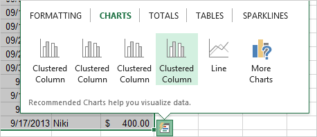
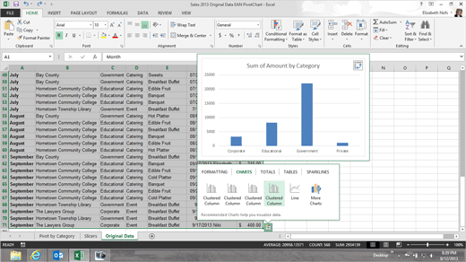
Exam 77-420 Microsoft Excel 2013 Quick Analysis puts everything we learned in this book at your finger tips. You can use Quick Analysis to create Conditional Formatting, Charts, Total, Tables and even Sparklines. This is a useful tool. 1. Try
This: Use Quick Analysis Go to the
Original Data spreadsheet. Select a Range:
A1:H71. Look for the Quick Analysis Tool: You should
see a small Wizard just outside of the Range of Cells you selected. And Definitely Try
This: Use Quick Analysis Click on Quick Analysis. OK, that
works. Keep going... Quick Analysis ->Charts
->Clustered Column
|
|

| |