Exam 77-420 Microsoft Excel 2013 Say you wanted
to compare salary and hourly wages. The two data sets have vastly
different scales. Salary is measured in thousands per year. Wages would
be dollars per hour. You can add
more than one axis when you work with two dimensional (2D) charts. Select the
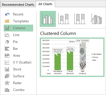
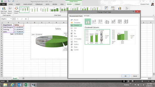
Salary Chart. Go
Chart Tools -> Design-> Type. Click on Change Chart Type.
|
|

| |