|
Exam 77-420 Microsoft Excel 2013 4.
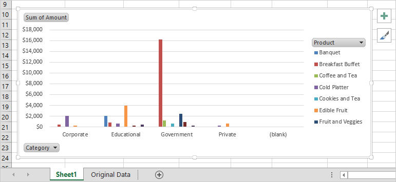
What Else Do You See? When you switched the Rows and Columns,
the PivotChart was updated as well. This PivotChart uses color and
position to display the sales data. Each product listed on the
Axis can have up to four columns of data. The Sum of Amount is
displayed on the left, formatted as accouting. What Do You
Think? Can you read and understand this PivotChart? Keep
going...!
|
|

| |